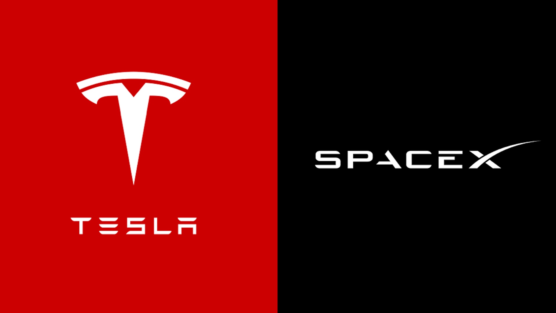
The logo design industry may be challenging. A graphic designer’s sleep may be disrupted by the slightest of flaws, such as a crooked line here or an off-angle there, even in the most seemingly straightforward symbols. Apparently, Elon Musk is not exempt from the pain of striving for the ideal logo. As of late, Musk has been using his preferred social media channel to discuss the origins of the SpaceX and Tesla logos, especially the SpaceX Logo.
And it turns out that one holds a hidden message while the other has changed considerably over time. Not quite an earth-shattering visual joke, but okay, I can see that. Musk said in response to a fan who praised the SpaceX logo (Musk’s contribution to the Billionaire Space Race). He explained that the swoop of the ‘X’ is “meant to reflect the rocket’s arc to orbit.”
Musk responded to another fan on Twitter by saying he “slightly agonized” about the typeface style for the Tesla wordmark, especially with regard to the usage of negative space. He said that the design had undergone “many tiny adjustments over the years,” but he did not specify what had changed. For us type enthusiasts, it would be fascinating to observe what changes have been made to fonts throughout the years.
There are many more designs with secret meanings than the SpaceX logo. Over the last several years, a plethora of logo “secrets” have surfaced, from the Bluetooth logo to the Toyota logo. Speaking of Tesla, wait till you see what some people imagine the letter “T” to look like. It’s important to note that not all of these are intentional.
Source: Creativeblog

